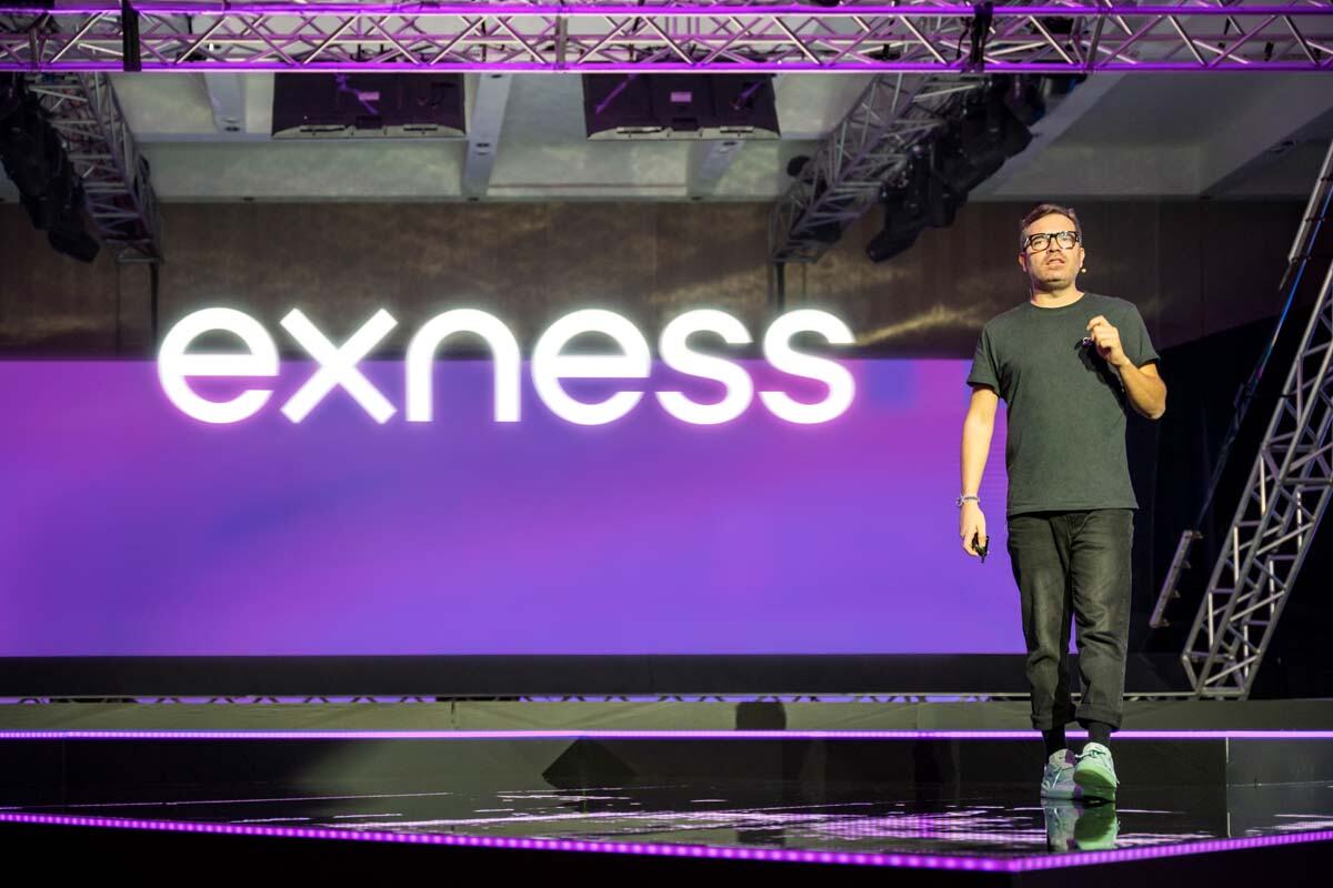
Exness has set the stage for a significant rebranding initiative that not only mirrors its journey to the top but also propels it further as a market leader. Through a carefully crafted visual identity, the company sheds its old skin and embraces a sleeker, more modern design that captures the essence of its success.
The exo emblem
Central to Exness’s rebranding is the introduction of a new logo – the exo emblem. This distinctive symbol, inspired by the company’s initials ‘e’ and ‘x,’ embodies a fusion of head and heart, the mathematical and the human. The exo serves as a visual anchor, connecting Exness’ past achievements with its future vision, bridging legacy with innovation.
Carrying the legacy of the old logo, the exo ensures continuity, acknowledging past accomplishments while signaling a transformative journey ahead. The brand’s font and color palette have undergone a makeover, featuring a more modern font and a brighter, bolder yellow. This update not only enhances visual appeal but also underlines Exness’ commitment to evolution and growth.
Legacy honored, future forged
Alfonso Cardalda, Exness’ chief marketing officer, emphasized that the rebranding is more than just a visual overhaul. He said, “At Exness, we believe that ‘good enough’ is not enough. This rebranding goes beyond aesthetics. Our new brand offers a nod to where we’ve come from and a promise that our values remain the same while we take bold new steps into the future. As companies evolve, so must their brand. It’s time for our brand to evolve and reflect who we are in the market. It’s time to take our identity to the next level, to show the world why we’re different from the rest and how we got this far.” The rebranding reflects the company’s dedication to staying true to its core principles while embarking on new endeavors.
Celebrating 15 years
Launched amid the celebration of Exness’ 15-year journey, the rebranding aligns with the broker’s remarkable achievements. Hence, Exness has achieved a monthly trading volume of up to $4.8 trillion, a workforce of over 2,000 employees, and a total of more than 700,000 active clients and 64,000 partners. These milestones underscore Exness’ commitment to setting industry standards and solidifying its position as a market leader.
Read: Damian Bunce: Exness is top brokerage with ‘better-than-market’ conditions
The road ahead
The updated branding is set to be rolled out across all Exness platforms in the coming weeks. Cardalda affirms a seamless transition stating, “As we usher this new era in, we will continue to reimagine the markets the way they should be, we will continue breaking records and we will continue to be wholeheartedly committed to our people — clients, partners, and employees.” The commitment to maintaining high standards of service and support remains unwavering during this transformative phase.
Exness’ rebranding initiative marks a bold leap into the future while honoring its rich legacy. The exo emblem, new font, and vibrant color palette signify not just a visual transformation but a commitment to values, innovation, and sustained excellence. As the broker continues to grow, this rebranding serves as a testament to its dedication to staying ahead of the curve and setting new standards in the trading industry.
For more miscellaneous news, click here.


